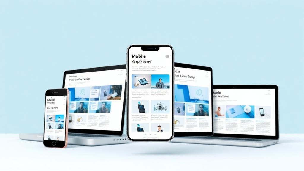
The Mobile-First Revolution
The way people access the internet has fundamentally changed. Mobile devices now account for over 60% of global web traffic, and this number continues to grow.
What Is Mobile-First Design?
Mobile-first design is an approach where you design for the smallest screen first, then progressively enhance the experience for larger devices. This is the opposite of the traditional approach of designing for desktop and then adapting for mobile.
Why Mobile-First Matters
1. Google Uses Mobile-First Indexing
Google now primarily uses the mobile version of your website for ranking and indexing. If your mobile experience is poor, your search rankings will suffer—even for desktop searches.
2. User Expectations Have Changed
Mobile users expect fast, seamless experiences. They'll quickly leave sites that are difficult to navigate, slow to load, or require pinching and zooming.
3. Conversion Rates Are at Stake
A poor mobile experience directly impacts sales. Studies show that 57% of users won't recommend a business with a poorly designed mobile site.
Key Principles of Mobile-First Design
Touch-Friendly Navigation
- Buttons and links large enough to tap accurately (minimum 44x44 pixels)
- Adequate spacing between interactive elements
- Easy-to-reach navigation (consider thumb zones)
- Simplified menu structures
Performance Optimisation
Mobile users often have slower connections and limited data:
- Compress and optimise images
- Minimise code and remove unnecessary scripts
- Use lazy loading for off-screen content
- Enable browser caching
- Consider AMP (Accelerated Mobile Pages) for content sites
Content Hierarchy
On smaller screens, every pixel matters:
- Prioritise essential content
- Use progressive disclosure (reveal details on demand)
- Keep forms short and simple
- Make calls to action prominent and accessible
Readable Typography
- Minimum 16px font size for body text
- Adequate line height (1.5x font size minimum)
- High contrast between text and background
- Avoid horizontal scrolling
Testing Your Mobile Experience
Use Real Devices
Emulators are useful, but nothing beats testing on actual devices. Test on both iOS and Android, across different screen sizes.
Check Key Metrics
- Page load speed (under 3 seconds)
- Core Web Vitals scores
- Mobile usability in Google Search Console
- Bounce rates and time on page for mobile visitors
Conduct User Testing
Watch real users navigate your site on mobile. You'll quickly identify pain points you might have missed.
Common Mobile Mistakes to Avoid
- Pop-ups that are difficult to close on mobile
- Forms with too many fields
- Tiny text or images requiring zoom
- Flash or other unsupported technologies
- Slow-loading hero images or videos
- Navigation buried in hamburger menus
The Future Is Mobile
5G networks, improved mobile browsers, and progressive web apps are making mobile experiences even more capable. Businesses that embrace mobile-first design now will be well-positioned for whatever comes next.
Start by auditing your current mobile experience. Use Google's Mobile-Friendly Test as a starting point, then dig deeper into analytics to understand how mobile users interact with your site.